River (typography)

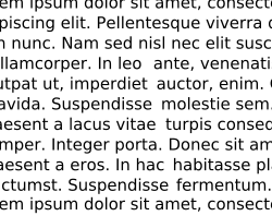
In typography, rivers, or rivers of white, are gaps in typesetting, which appear to run through a paragraph of text, due to a coincidental alignment of spaces.[1][2][3][4][5][6] The rivers can occur regardless of the spacing settings, but are most noticeable with wide inter-word spaces caused by full text justification or monospaced fonts. Rivers are less noticeable with proportional fonts, due to narrow spacing. Another cause of rivers is the close repetition of a long word or similar words at regular intervals, such as "maximization" with "minimization" or "optimization".
Rivers occur because of a combination of the x-height of the typeface (whether the type appears broad or skinny), the values assigned to the widths of various characters, and the degree of control over character spacing and word spacing. Broader typefaces are more prone to exhibit rivers, as are the less sophisticated typesetting applications that offer little control over spacing. Increased sentence spacing can also exaggerate the river effect. More sophisticated typesetting applications divide individual characters into larger numbers, giving more numerical control. They also offer more comprehensive libraries of "kerning pairs" that tell the application how much space to allow between all possible combinations of letter pairs.
Typographers try to minimize or eliminate the river effect. In Finer Points in the Spacing & Arrangement of Type, Canadian typographer Geoffrey Dowding explains as follows.
A carefully composed text page appears as an orderly series of strips of black separated by horizontal channels of white space. Conversely, in a slovenly setting the tendency is for the page to appear as a grey and muddled pattern of isolated spats, this effect being caused by the over-widely separated words. The normal, easy, left-to-right movement of the eye is slowed down simply because of this separation; further, the short letters and serifs are unable to discharge an important function—that of keeping the eye on "the line". The eye also tends to be confused by a feeling of vertical emphasis, that is, an up & down movement, induced by the relative isolation of the words & consequent insistence of the ascending and descending letters. This movement is further emphasized by those "rivers" of white which are the inseparable & ugly accompaniment of all carelessly set text matter.[7]
Typographers can test for rivers by turning a proof sheet upside down (top to bottom) to examine the text. From this perspective, the eye is less likely to recognize words and the type can be viewed more readily as an overall pattern.
Other related terms are lakes and holes, which refer to a cluster of adjacent or intertwined rivers that create a lighter area within a block of type.[8][9][10]
See also
Notes
- ↑ Dowding 1995. p. 29.
- ↑ Felici 2003. p. 80.
- ↑ Fogarty 2008. p. 85.
- ↑ Schriver 1997. 270.
- ↑ Smith 2009.
- ↑ Squire 2006. p. 65.
- ↑ Dowding 1995. pp. 5–6, 29.
- ↑ Garner 2006.
- ↑ Jury 2009. p. 58.
- ↑ Williams 2003. p. 13.
References
- Dowding, Geoffrey (1995). Finer Points in the Spacing & Arrangement of Type (Revised ed.). Vancouver, BC: Hartley & Marks Publishers. 90. ISBN 0-88179-119-9.
- Felici, James (2003). The Complete Manual of Typography. Berkeley, CA: Peachpit Press. 384. ISBN 0-321-12730-7.
- Fogarty, Mignon (2008). Grammar Girl's Quick and Dirty Tips for Better Writing. New York: Holt Paperbacks. 240. ISBN 978-0-8050-8831-1.
- Garner, Bryan A.; Jeff Newman; Tiger Jackson (2006). The Redbook: A Manual on Legal Style (2nd ed.). Thompson West. 1008. ISBN 978-0-314-16891-7.
- Jury, David (2009). "What is Typography?" (PDF). Rotovision. pp. 28–87. Retrieved 31 March 2010.
- Schriver, Karen A. (1997). Dynamics in Document Design. New York, Chichester, Brisbane, Toronto, Singapore, Weinheim: John Wiley & Sons. 592. ISBN 0-471-30636-3.
- Smith, Laurie (8 July 2009). "Don't Date Yourself by Using Two Spaces after a Period in Your Resume!". Executive Resumes and Career Transition Strategies: Reflections of an Executive Resume Writer. Creative Keystrokes Executive Resume Service. Retrieved 30 March 2010.
- Squire, Victoria; Willberg, Hans Peter; Forsmann, Friedrich (2006). Getting it Right with Type. London: Laurence King Publishing. 176. ISBN 978-1-85669-474-2.
- Williams, Robin (2003). The Mac is Not a Typewriter: A Style Manual for Creating Professional-level Type on Your Macintosh (2nd ed.). Berkeley, CA: Peachpit Press. 96. ISBN 0-201-78263-4.