Subtractive color


A subtractive color model explains the mixing of a limited set of dyes, inks, paint pigments or natural colorants to create a wider range of colors, each the result of partially or completely subtracting (that is, absorbing) some wavelengths of light and not others. The color that a surface displays depends on which parts of the visible spectrum are not absorbed and therefore remain visible.
Subtractive color systems start with light, presumably white light. Colored inks, paints, or filters between the watchers and the light source or reflective surface subtract wavelengths from the light, giving it color. If the incident light is other than white, our visual mechanisms are able to compensate well, but not perfectly, often giving a flawed impression of the "true" color of the surface.
Conversely, additive color systems start with darkness. Light sources of various wavelengths are added in various proportions to produce a range of colors. Usually, three primary colors are combined to stimulate humans’ trichromatic color vision, sensed by the three types of cone cells in the eye, giving an apparently full range.
RYB

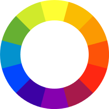
RYB (Red, Yellow, Blue) is the formerly standard set of subtractive primary colors used for mixing pigments. It is used in art and art education, particularly in painting. It predated modern scientific color theory.
Red, yellow, and blue are the primary colors of the standard color "wheel". The secondary colors, violet (or purple), orange, and green (VOG) make up another triad, formed by mixing equal amounts of red and blue, red and yellow, and blue and yellow, respectively.
The RYB primary colors became the foundation of 18th century theories of color vision as the fundamental sensory qualities blended in the perception of all physical colors and equally in the physical mixture of pigments or dyes. These theories were enhanced by 18th-century investigations of a variety of purely psychological color effects, in particular the contrast between "complementary" or opposing hues produced by color afterimages and in the contrasting shadows in colored light. These ideas and many personal color observations were summarized in two founding documents in color theory: the Theory of Colors (1810) by the German poet and government minister Johann Wolfgang von Goethe, and The Law of Simultaneous Color Contrast (1839) by the French industrial chemist Michel-Eugène Chevreul.
In late 19th and early to mid-20th century commercial printing, use of the traditional RYB terminology persisted even though the more versatile CMY (Cyan, Magenta, Yellow) triad had been adopted, with the cyan sometimes referred to as "process blue" and the magenta as "process red".
CMY and CMYK printing processes
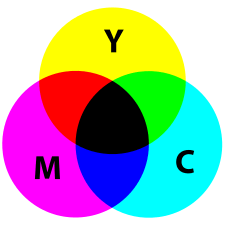
In color printing, the usual primary colors are cyan, magenta and yellow (CMY). Cyan is the complement of red, meaning that the cyan serves as a filter that absorbs red. The amount of cyan applied to a white sheet of paper controls how much of the red in white light will be reflected back from the paper. Ideally, the cyan is completely transparent to green and blue light and has no effect on those parts of the spectrum. Magenta is the complement of green, and yellow the complement of blue. Combinations of different amounts of the three can produce a wide range of colors with good saturation.
In inkjet color printing and typical mass production photomechanical printing processes, a black ink K (Key) component is included, resulting in the CMYK color model. The black ink serves to cover unwanted tints in dark areas of the printed image, which result from the imperfect transparency of commercially practical CMY inks; to improve image sharpness, which tends to be degraded by imperfect registration of the three color elements; and to reduce or eliminate consumption of the more expensive color inks where only black or gray is required.
Purely photographic color processes almost never include a K component, because in all common processes the CMY dyes used are much more perfectly transparent, there are no registration errors to camouflage, and substituting a black dye for a saturated CMY combination, a trivial prospective cost benefit at best, is technologically impractical in non-electronic analog photography.
See also
References
| Wikimedia Commons has media related to Subtractive colors. |
- Berns, Roy S. (2000). Billmeyer and Saltzman's Principles of Color Technology, 3rd edition. Wiley, New York. ISBN 0-471-19459-X.
- Stroebel, Leslie, John Compton, Ira Current, and Richard Zakia (2000). Basic Photographic Materials and Processes, 2nd edition. Focal Press, Boston. ISBN 0-240-80405-8.
- Wyszecki, Günther & W. S. Stiles (1982). Colour Science: Concept and Methods, Quantitative Data and Formulae. Wiley, New York. ISBN 0-471-02106-7.
External links
- Stanford University CS 178 interactive Flash demo comparing additive and subtractive color mixing.