Taylor diagram
Taylor diagrams are mathematical diagrams designed to graphically indicate which of several approximate representations (or models) of a system, process, or phenomenon is most realistic. This diagram, invented by Karl E. Taylor in 1994 (published in 2001[1]) facilitates the comparative assessment of different models. It is used to quantify the degree of correspondence between the modeled and observed behavior in terms of three statistics: the Pearson correlation coefficient, the root-mean-square error (RMSE) error, and the standard deviation.
Although Taylor diagrams have primarily been used to evaluate models designed to study climate and other aspects of Earth’s environment,[2] they can be used for purposes unrelated to environmental science (e.g., to quantify and visually display how well fusion energy models represent reality[3]).
Taylor diagrams can be constructed with a number of different open source and commercial software packages, including R,[4] MATLAB,[5][6] IDL,[7] UV-CDAT,[8] and NCL.[9]
Sample diagram
The sample Taylor diagram shown in Figure 1[10] provides a summary of the relative skill with which several global climate models simulate the spatial pattern of annual mean precipitation. Eight models, each represented by a different letter on the diagram, are compared, and the distance between each model and the point labeled “observed” is a measure of how realistically each model reproduces observations. For each model, three statistics are plotted: the Pearson correlation coefficient (gauging similarity in pattern between the simulated and observed fields) is related to the azimuthal angle (blue contours); the centered RMS error in the simulated field is proportional to the distance from the point on the x-axis identified as “observed” (green contours); and the standard deviation of the simulated pattern is proportional to the radial distance from the origin (black contours). It is evident from this diagram, for example, that for Model F the correlation coefficient is about 0.65, the RMS error is about 2.6 mm/day and the standard deviation is about 3.3 mm/day. Model F’s standard deviation is clearly greater than the standard deviation of the observed field (indicated by the dashed contour at radial distance 2.9 mm/day).
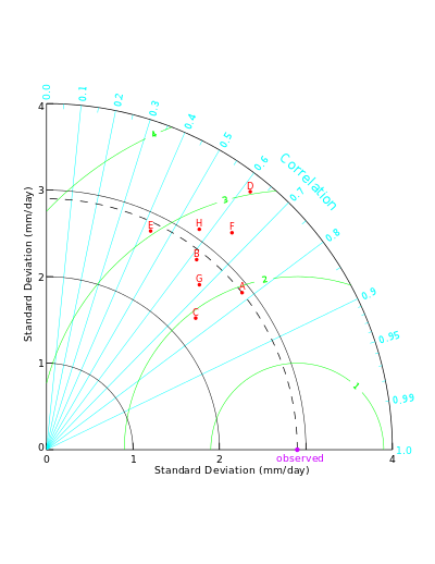
The relative merits of various models can be inferred from figure 1. Simulated patterns that agree well with observations will lie nearest the point marked "observed" on the x-axis. These models have relatively high correlation and low RMS errors. Models lying on the dashed arc have the correct standard deviation (which indicates that the pattern variations are of the right amplitude). In figure 1 it can be seen that models A and C generally agree best with observations, each with about the same RMS error. Model A, however, has a slightly higher correlation with observations and has the same standard deviation as the observed, whereas model C has too little spatial variability (with a standard deviation of 2.3 mm/day compared to the observed value of 2.9 mm/day). Of the poorer performing models, model E has a low pattern correlation, while model D has variations that are much larger than observed, in both cases resulting in a relatively large (~3 mm/day) centered RMS error in the precipitation fields. Note also that although models D and B have about the same correlation with observations, model B simulates the amplitude of the variations (i.e., the standard deviation) much better than model D, resulting in a smaller RMS error.
Theoretical basis
Taylor diagrams display statistics useful for assessing the similarity of a variable simulated by a model (more generally, the “test” field) to its observed counterpart (more generally, the “reference” field). Mathematically, the three statistics displayed on a Taylor diagram are related by the following formula (which can be derived directly from the definition of the statistics appearing in it):
,

where ρ is the correlation coefficient between the test and reference fields, E′ is the centered RMS difference between the fields (with any difference in the means first removed), and and are the variances of the reference and test fields, respectively. The law of cosines where a, b, and c are the length of the sides of the triangle, and φ is the angle between sides a and b) provides the key to forming the geometrical relationship between the four quantities that underlie the Taylor diagram (shown in figure 2).


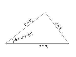
The standard deviation of the observed field is side a. The standard deviation of the simulated field is side b, the centered RMS difference between the two fields (E′) is side c, and the cosine of the angle between sides a and b is the correlation coefficient (ρ).


Note that the means of the fields are subtracted out before computing their second-order statistics, so the diagram does not provide information about overall biases, but solely characterizes the centered pattern error.
Taylor diagram variants
Among the several minor variations on the diagram that have been suggested are (see, Taylor, 2001[1]):
- extension to a second "quadrant" (to the left of the quadrant shown in Fig. 1) to accommodate negative correlations;
- normalization of dimensional quantities (dividing both the RMS difference and the standard deviation of the "test" field by the standard deviation of the observations) so that the "observed" point is plotted at unit distance from the origin along the x-axis, and statistics for different fields (with different units) can be shown in a single plot;
- omission of the isolines on the diagram to make it easier to see the plotted points;
- use of an arrow to connect two related points on the diagram. For example, an arrow can be drawn from the point representing an older version of a model to a newer version, which makes it easier to indicate more clearly whether or not the model is moving toward "truth," as defined by observations.
References
- 1 2 Taylor, K.E. (2001). "Summarizing multiple aspects of model performance in a single diagram". J. Geophys. Res. 106: 7183–7192. doi:10.1029/2000JD900719.
- ↑ In the period 2012-2015, Google Scholar lists more than 1000 citations of Taylor (2001), the first scholarly article describing the Taylor diagram.
- ↑ Terry, P.W.; et al. (2008). "Validation in fusion research: Towards guidelines and best practices". Phys. Plasmas. 15. doi:10.1063/1.2928909.
- ↑ inside-R: taylor.diagram {plotrix}
- ↑ MathWorks File Exchange: Taylor Diagram
- ↑ MathWorks File Exchange: Skill Metrics Toolbox
- ↑ Coyote’s Guide to IDL Programming: Creating a Taylor Diagram
- ↑ CDAT: Taylor Diagrams
- ↑ NCL Special Topics: Taylor Diagram
- ↑ Taylor diagram primer (2005), K.E. Taylor